Wednesday, July 28, 2010

Digital Bulletin Board

I recently discovered pinterest.com, a site that functions as a digital bulletin board. Instead of adding websites to your bookmarks toolbar, you can "pin" things you like to your "pinboard".

You can create pinboards about anything. Several templates are pre-loaded with titles such as "books to read", "for the home", "my style pinboard" etc, but can delete or edit these, as well as create your own category.
The site is very easy to use, just drag the "pin it" widget into your browser toolbar. When you come across something you like, click on the widget. A new window pops up- you can select exactly what you want to pin, and to which category.

Next add a description and tags. The site will automatically add the source, no need to keep track yourself!

Pinterest is also linked to facebook and twitter. You can "follow" other users, and "repin" items you like to your own pinboards.

To create an account, you have to sign up for the waitlist but I found it was very quick. Once you are signed in, you can invite up to five friends to join as well.

To see more, follow my pinboards here

Monday, July 26, 2010

E invitations

Online invitations, a.k.a "e-vites" are an excellent choice for many reasons-they're free, paperless and quick and easy. Two sites that I use frequently are evite.com and mypunchbowl.com
Here are some highlights of each.

Evite
  • completely free (you need to register for an account)
  • quick and easy to use
  • pre-made templates for every category
  • custom options are somewhat limited but you can change the design image or "design your own" from scratch
  • easily import your contacts from email accounts such as gmail and hotmail
  • guests options such as potluck requests, polls, even let guests create a playlist
  • links to google maps
  • option to post the invitation to facebook
  • tracks rsvps for you
  • after the event, guests can post photos
  • free e-cards available
To create an account go to http://www.evite.com/

Punchbowl
  • a digital version of a real invitation-designs have envelopes
  • classier than a usual e-invitation
  • basic options are free-you can upgrade your account to "plus" or "premium" for a monthly fee
  • customize options such as background and text colour, add a photo
  • tracks rsvps for you
  • links to social media-facebook, twitter, linked in, my space
  • free e-cards available
  • party planning options-find a venue, create a budget, order party supplies etc.
To create an account go to http://www.mypunchbowl.com/

Friday, July 23, 2010

DIY greeting cards and invitations

Materials needed:
  • pre-made envelopes, in any size
  • variety of decorative papers-I used scrapbooking paper
  • embellishments: die cuts, glitter, stickers, scraps of ribbon, etc.
  • glue stick
  • glue gun for thicker elements (if using)
  • bone folder (optional)
  • cutting mat and xcato knife or paper cutter

The only essential aspect of making your own cards is making sure they fit into the envelopes.
Other than that, let your imagination run wild!


Craft stores sell blank card and envelope sets. This project is even easier with pre-made cards, just decorate! Each card takes only a minute or two.

If you are making invitations, you will likely want to make them all the same. I don't think this is strictly necessary-your guests won't compare them! But it is easiest to make them all the same colour scheme, you can vary the patterns and shapes if you like.

For invitations print out all the details such as date, time, location and the contact information for the guests to rsvp and print out as many copies as you need from your home computer.
Glue this sheet into each invitation.

This is really a creative exercise, you can make cards and invitations in any colour scheme and pattern you like.

Here are some samples I created using leftover scrapbooking supplies and bits and bobs I had lying around the house. I confess I save ribbon-I have a drawer full of random pieces.


This could be an invitation or a card for a wedding, an engagement party, a shower, or an anniversary party.


This card or invitation is more general-it could be for birthdays or as a thank you card.

It really only takes a few minutes to make a card and it's a really nice way to create a hand made custom card. Tailor the card to the person it's for, the event, or even to the wrapping paper.

Most of all-be creative and have fun!

Thursday, July 22, 2010

Book Review-Real Simple Weddings


From the Editors of Real Simple Magazine, 2009

Technically this is a single issue magazine not a book, but it's close enough for me.
I received this as a gift after I had already begun my planning process, so I really didn't use it to it's full potential. However, I find it so helpful that I wanted to write about some higlights and features.

At 160 pages, it is jammed with useful tidbits interspered with lovely photographs. One of the features are "real weddings" in each chapter linked with that topic.

The book is divided into three sections, with ten chapters covering every aspect of weddings-calendars and timelines, attire, invitations, ceremony ideas and much much more.

The planning section includes handy worksheets with timelines, checklists and budgets.

A nice bonus is the pull-out quick reference guide. It's small enough to carry around with you in your purse, and has spots to jot down contact information for vendors as well as checklists.

The only negative-the local vendors resource list is all American sources.

Each section contains common questions, as well as features based on style and season.

The chapter on wedding and bridesmaids dresses is nicely divided into body types, as well as by season with full colour photographs.

The common flowers used in weddings are nicely laid out in a chart with season, colour and average price.

The index has tons of websites broken down for each chapter.

Overall, this book is an excellent resource. If you are looking for a guide-pick this one up for it's helpful information and insipirational photographs. It is worth it.

To buy:
http://www.realsimple.com/work-life/books-back-issues-subscriptions-00000000017526/

Note: the 2010 edition is also available in stores or online

Thursday, July 15, 2010

Mary and Doug's Wedding-Card Box

Card boxes are expensive. This does not make sense to me. It is a box, that you put cards in. That's it.

I had some leftover wrapping paper that I used to make the message board, so I decided to diy a card box. Quite simple really. All you need is a box, some wrapping paper, and some tape. The box I used is a 1/2 ream copy paper box. I picked it up at Staples for free. They will usually give you their leftover boxes if you ask. You could also use a shoe box, a wine box or a box that's used to send packages in the mail.


I wrapped the box in two parts-the lid is wrapped separately. This makes it easier to take the cards out, no need to unwrap the whole thing! I didn't bother to wrap the parts that you can't see. Leaving at bit of space where the body meets the lid is a good idea, it lets the lid slide on and off much easier, and prevents the paper from ripping. I did spray paint the box silver, since the paper is white I didn't want any text to show through. This probably isn't necessary for most papers. There is one seam, but if you turn it towards the wall no one will see it.


I cut a whole in the top with an xcato knife, and used some regular tape to adhere the cut edges of the paper on the inside of the slot, so it looks neater. You can see in this photo how I wrapped the edges of the paper and taped them on the underside. It looks similar on the bottom of the box.


Voila! Easy peasy. And much much cheaper than renting or buying a premade one. The box was free, and I used the rest of the leftover paper from the message board project, so that was also free. Got to love a free project that is both useful and pretty.

Wednesday, July 14, 2010

Wedding Show Review

Wedding shows can be daunting, but if you`re smart you can get alot of planning done in one location. Husband and I went to two shows-a large one downtown Toronto and a smaller one in Hamilton. Here are some tips, pros and cons to make the most of your visit.

Large Shows:

It is worth going to one of these large shows, especially in the early planning stages. The best thing you can do is be prepared. Most wedding shows have a list of vendors and a map on their websites. Print one off, highlight booths you are interested in, and try to go there first before you get overwhelmed by the crowds

The Good:
  • lots of vendors in one location
  • easy to compare prices and services
  • good for inspiration, to see what you like and don`t like
  • The freebies! Tons and tons of free stuff-resuable shopping bags, samples, free wedding magazines, wedding planners etc.
  • Free admission
The Bad:
  • Freebies! Be prepared to carry alot of heavy stuff. We actually saw some couples with small rolling suitcases. You might scoff, but I am sure their arms were alot less tired than ours!
  • The crowds-it`s hard to get close to some booths, or to really see the fashion shows. Watch out for pushy Bridezillas
  • I found the customer service less than stellar. There are so many people, vendors don`t have the time to spend with customers
  • Oodles and oodles of paper! I found this VERY wasteful. I ended up recycling most of what I brought home
  • finding parking was terrible
  • I found it very loud-constant announcements
  • be careful filling out all those ballots. I was inundated with telemarketers and junkmail for weeks afterward. I apparently "won" a free honeymoon, it turned out to be a timeshare scam
What I learned:
  • what I don`t like-this is actually very helpful and can help you narrow your choices
  • we found a gorgeous handpainted cake inspired by Claude Monet. It was way too expensive but we walked away with our colour scheme-tones of purple and smoky silvery-gray. We kept that cake in the back of our minds throughout the rest of the planning
  • it's really not worth going to more than one large show, you will find the same stuff over and over again, you will get burned out and you won't take anything in after awhile. After a few hours my eyes glazed over, and I was just wandering without purpose.
Small Shows:

The Good:
  • less crowded
  • local vendors
  • customer service was much better!
  • you can get close to the booths, and actually see the fashion show
  • you can easily see everything in just a few hours
The Bad:
  • less choice, fewer vendors of each type
  • not as much freebies
  • parking might not be free
  • admission might not be free-but brides are usually admitted at no charge
What I learned:
The small show was a goldmine! All the following were sourced there:
  • the violinist!
  • the DJ
  • the cake
  • my wedding dress
  • bridesmaid's dresses
  • travel agent for honeymoon
  • the free wedding planner I used for tracking timelines
Not bad for an afternoon, huh?

Thursday, July 8, 2010

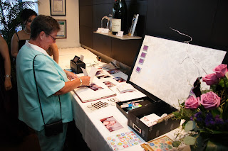
Mary and Doug's Wedding-Favours/Escort Cards

DIY Magnetic Board

To serve as a combination of decoration, escort cards and guest favours I fancied up a magentic message board I bought at walmart. I originally was going to spray paint the frame silver but I decided to keep it black. I like the contrast between the white and silver motif and the frame. I picked up a roll of wedding gift wrap-white background with an oversized floral damask pattern. I cut the paper to size, and used spray adhesive to adhere it to the message board. I went a bit overboard on the glue, it was a bit bumpy so I used a bone folder to smooth it out. I used a bit of double sided tape to adhere the corners for extra durability.


This particular board is 22 inches wide by 35 inches long. It's the biggest one I could find.

This project could easily be adapted for a home office, craft room or children`s bedroom. Simply pick a pattern you like, in the colour scheme of your choice. I find the thicker wrapping papers are best, you want it to be thick enough to withstand some abuse, but not too thick that magnets won`t stick.


The escort cards themselves are small silver magnetic photo frames. I ordered these ones online from a wedding favour store, but I have seen them in stores. Husband created the name cards with Adobe Illustrator in a grid pattern. Remember to measure the insert that comes with the frame, and watch the margins to make sure the text doesn't get cut off by the edge of the frame. It might take a bit of trial and error to get it right.
We printed them at a copy store, cut them out, and stuck them in the mini frames while watching t.v. We organized them alphabetically by last name on the message board-easy to do since the backs are magnetic. Since we only had 57 guests, it was easy to fit all the little frames onto the board. If you have a lot of guests, make two board and split the alphabet.


The frames served as both escort cards, and a useful favour to take home. Guests can simply add the photo of their choice and stick to the fridge, or any other magnetic surface.

Mary and Doug's Wedding-Music and Entertainment


Music
For the cocktail reception and ceremony we hired Grenville Pinto, a fabulous electric violinist. We can't praise him enough! Rave reviews from our guests, and from people waiting in the lobby to see a show in the theater.
For cocktails, I gave Grenville carte blanche to play whatever he liked. My favourites were Thunderstruck, AC/DC and Say It Right, Nelly Furtado.

For the processional-we chose Halo, Beyoncé and added a little of Canon in D.
For the signing-Life in Mono, Emma Bunton.
The recessional was Viva La Vida, Coldplay.

Check out Grenville Pinto on YouTube. He is a-mazing!

Reception Music was provided by ThunderDj, from Burlington.
We chose a mix of retro and top 40. First dance was Come Away With Me, Norah Jones. We limited the slow dance songs, we really wanted to keep the energy high. Most guests never stopped dancing.
The only thing I would change-we rented a dance floor which was installed over the carpet. I wouldn't bother next time, people were dancing on the carpet anyway and the edges of the flooring were a bit awkward-not exactly the best choice when alcohol is involved.

Entertainment
To give our guests something to do to fill what little downtime there was, we set up a photo printer and scrapbooking station.
The printer we bought is the HP photosmart A630 compact photo printer. This printer is awesome! It has multiple slots for different kinds of memory cards, USB port, even Bluetooth to send pictures through smartphones. Very impressive.

We provided an assortment of stickers, fancy markers and pens, and other scrapbooking paraphernalia-easily sourced from craft and dollar stores. Everyone took a photo of themselves and added a message for us. Most people had their own cameras or smartphones, but we also had a few on hand. I assigned two bridesmaids to man the station. The guests had a great time, and we got to take home an album full of memories.


Tuesday, July 6, 2010

Mary and Doug's Wedding-Flowers

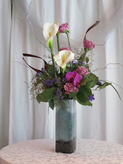
Floral arrangements by Pamela Atkinson, Red Blush Designs

Flowers:
  • white calla lilies
  • plum calla lilies
  • cool water roses
  • vandella roses
  • white tulips
  • purple tulips
  • purple statice
  • purple orchids
  • curly willow (spray painted silver)
  • lily grass
  • salal leaves
  • seeded eucalyptus
Bouquets:


Bridesmaid's Bouquets


Bridal Bouquet

Decorative arrangements:


Two large rectangular arrangements were used at the front of the room for the ceremony, and moved adjacent to the head table for the reception. I actually scouted the vases from the women's washroom at a shopping mall. I asked the information desk for the contact information of the shop they came from.
I was able to order them and pick them up at the store.

Lesson-be resourceful, inspiration can come from unexpected places

After the ceremony we moved the bouquets to the front of the dining room. I picked up a few cheap rectangular vases at Walmart. With very few singles attending, we decided to forgo the traditional bouquet and garter toss.

Lesson- dont' be afraid to adapt or remove elements if they don't suit your style, or the type of wedding you want. No one will notice anyway!


Centrepieces:


The process to decide on centrepieces was quite exhaustive. Nothing seemed quite right, not until Husband found these on sale at a home décor store. They are actually meant as an oil diffuser, but we immediately saw the potential.
The store didn`t have enough in stock, we needed 8 but they were able to order us more at the sale price! Bonus!
The set comes with a mirrored tray, two round votive holders, a small square vase, the lid, the wooden sticks, some tea lights and a bottle of scent. The tea lights were too yellow, so I swapped them out for white floating candles that I bought in bulk at a craft store. We didn`t use the sticks or lids, but I keep the boxes with the pieces inside. We stashed the boxes under the tables, for the guests to take the centrepiece home, and so they could use it for it`s true purpose if they desired. We love them either way.


Monday, July 5, 2010

Mary and Doug's Wedding-overview

Date: Saturday May 29th, 2010
Venue: Live Cuisine, Living Arts Center, Mississauga Ontario
Guests: 57
Budget: >$17,000
Colour scheme: shades of purple, pewter grey, white, black

Theme:
modern elegance

Specifications:

  • modern venue, not a typical banquet hall, everything in one location
  • indoors
  • nontraditional format, had to be multicultural
  • late afternoon-evening
  • limited guests to family and close friends
  • contemporary but still elegant, and on a budget


Order of Events:

1. tea ceremony
2. formal photographs
3. cocktails and hors d'oeuvres
4. legal ceremony
5. informal photographs
6. reception
7. dancing

Menu
Assorted hors d'oeuvres:
  • Vegetarian Spring Rolls
  • Crab Cakes
  • Mini Beef Wellington
  • California Rolls
  • Lobster Crépe Purse
First Course
  • Wild mushroom consommé
Second Course
  • Watercress and Romaine salad, balsamic vinaigrette
Third Course
  • Free range chicken with grand marnier sauce, mini potatoes, vegetables
Fourth Course
  • Fruit Bavarois
  • Wedding cake: vanilla cake, raspberry pureé, vanilla buttercream
The Big spending:
  • Food and alcohol
  • Music-violinist and DJ
The Big Savings:
  • free invitations- e-invites from mypuchbowl.com
  • wedding dress-bought at a charity sale
  • flowers-bride's sister donated her time-only paid for supplies
  • decorations and favours-DIY


Why Hire An Event Planner?

Why should you hire an event planner?

Three big reasons:

1. Save Money-even with the costs of hiring an event planner, you will still save money. Event planners can negotiate deals-and can often get freebies such as free parking, or a free microphone and podium thrown into the package for you.

2. Save time-planning an event is a lot of work! More than most people realize. Event planners can save you hours! This is especially true one month-one week before the event. Save your energy- hire someone to plan all those details for you.

3. Peace of mind -how do you know who is the best person for the job? Think about how many people are involved in an event-flowers, stationary, cake, venue, photographer, dj and other entertainment, transportation, etc.... the list goes on and on.
Event planners know people! They have contacts! This is crucial! Not only saving time and effort, but they know the right people for the job.

There are many other ways event planners can help, but these three pay off the most.